
Week 2 of the Spring 2021 One Room Challenge! And it turns out writing this post this week was harder than expected. This is my third draft, let’s hope it’s the charm.
I am a graphic designer by trade, but I did work as an interior designer two decades ago. I worked with an architect at a non-profit research and development firm designing office space. I learned so much at that job: designing the function and flow of a space, the importance of lighting, and how to choose a blue paint that doesn’t lean too much into purple so that my co-workers/contractors would not give me the nickname “Purple Patti.” You can not image the utter horror that nickname instilled in me.
Picking colors is hard. I get why people are afraid to commit to a color. Here are my two big recommendations with paint colors:
- Always go grayer and duller than you think you should. Bright colors in paint decks feel good in small amounts. Not so much when you get it up at 1000x magnitude on your walls. (This is a general rule, obviously it won’t apply to people who genuinely want to live in brightly colored rooms. I admire these people, I think they are incredibly gutsy and confident. See: Dabito or Natalie Papier.)
- Do not rely solely on paint decks or paint chips. Buy sample cans of your top picks and try them in your space. Paint directly on the wall or onto a LARGE sheet of paper and hang that on the wall. And live with it for at least two days. See what the color looks like at all times of day. I still do this in spaces I design. Except when I get cocky and try to cheat it and pick from the deck, and then I end up re-painting. Every time. Seriously, every single time. Which leads me to…
- Don’t be afraid to re-paint. That color you put up on the wall is not a person you married, you can change it fairly easily. I know it’s hard to admit a mistake, but just do it, admit it!, and move on. Learning from mistakes is gratifying. Trust me, you will feel like a better person in the end. Not only will you have a room you feel better in, but you will have solved a problem and that always feels good.
I don’t have to pick a wall paint for this porch space (although hoo boy don’t get me started on how much I would LOVE to paint the vinyl siding on the entire house—I am not a fan of white houses), but I did want to pick a much more gray and subdued blue for the ceiling. Mostly because that zingy sky blue we originally painted up there is just too bright. It’s a strong color—it was fighting with my idea of a soft and cozy space. And it wasn’t feeling harmonious with the fabrics I want to bring into the space.
And this brings me to the crux of this post: color theory and admitting mistakes. Behind all types of design are some core theories that hold true—color theory being one of the big ones. I work with color EVERY DAY. And even with all my training and career experience, I sometimes get this wrong. So I don’t blame people when they are afraid to make color choices in their own home.
So while I show you what I worked on this week—sewing pillows and covers for the porch furniture, I want to also talk a bit about color theory.
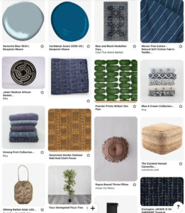
Here’s a snapshot of my front porch redesign Pinterest board with the old ceiling blue. (Cloudless from Sherwin Williams.)
That ceiling blue in the upper left is just SO BRIGHT. I want a quieter feeling here. The white walls area already bright enough. So I played with some duller, grayer blues and landed on Benjamin Moore Santorini blue:
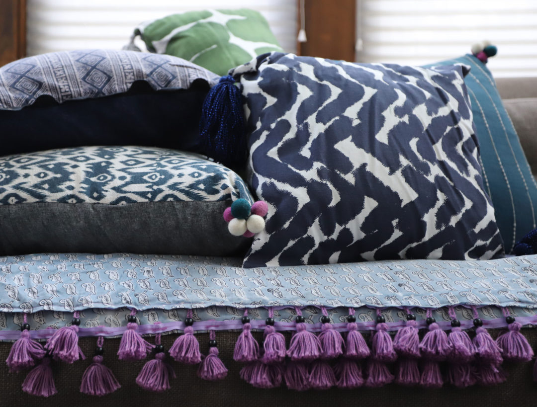
See how that quieted things down? Everything feels soft now. I am sold. So I started making couch covers and pillows. You can see the fabrics I used in the Pinterest boards above, but also in the photo at the top of the post. I’m not going to give you step by step instructions on how to sew a pillow—there are many patient and qualified YouTubers out there for you to learn that from.
I will say that, after much trial and error over the decades, the most important thing to me in a pillow cover for our front porch is that it be easy to get on and off. And that it be cotton or something similarly easy to throw in a washing machine and dryer. Between being outside and dogs being allowed on the furniture, these pillows will get dirty. I need to be able to whip these pillow covers off and throw them in the washing machine on a regular basis. Here is a really good pattern and tutorial for easy pillow covers (no zippers! no buttonholes!) which is how I made mine.
Fortunately, these pillows don’t get direct sun, so I don’t need a fade resistant fabric. They will lighten over the course of a few years, they do get a good amount of indirect light, but by the time they fade I will want to switch them out anyway.
And here’s a BIG TIP when sewing anything: always wash and iron your fabric BEFORE you cut and sew. If you don’t, the fabric will shrink the first time you wash the covers and the insert will no longer fit in them.
But back to color, here’s what I realized once I had made these pillows. I wasn’t liking the color story.
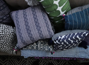
It’s harmonious and calm, for sure. I like that. But it’s feeling flat to me. The green and lilac aren’t doing enough to alleviate the sameness of the indigo blues. Green, blue, and purple are next to each other on the color wheel and that’s why they are harmonious. But these colors are all too close in *value* as well. The dark indigo and the dark emerald green and the black are all very similar in value—they are deep colors. The lilac is not, it’s value is a lot lighter, but it’s not enough to break things up for me.
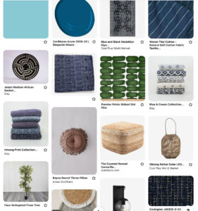
What I need is a complementary color. (Opposite on the color wheel.) For dark indigo, that would be orange. (My favorite color! NOT.) For emerald green, that would be red. For lilac, that would be butter-y yellow. All three would add tension and would break up the monotony of the blue tones. But I don’t want something of the same value—I want something light to break up the dark values. So I started playing and landed on this:
I like how the orange-y pecan color played with the indigo blues and even the lilac. But the green and pecan was a no-go for me. I’d have to lose the green and I found I really didn’t like that idea. Plus the value is too dark, it’s too strong. So I went back to the drawing board and came up with this:
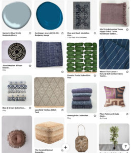
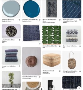
So much better! That stone-y tan will give me some more neutral, yet warm tones. It’s a lighter value than the emerald and indigo. It doesn’t create tension so much, but it does break up all the blue. I also added in some more lilac. In the form of a throw blanket and that St. Frank pillow that I WANT TO MARRY I love it so much. It brings in tan too.
I will talk about creating couch covers next week. The new tan fabric just came in yesterday, so I can start work on that ASAP. See you next week!